3 Essential Tips to Creating a Strong Brand Profile Picture
Profile pictures may seem like one of those oh-so-simple things, but they are far from it. At this point, you may be thinking, ‘Nah, my profile picture is great,’ and it may well be—but you may also be falling into common and seemingly obvious traps which aren’t, actually, so obvious.
Three key aspects make up a good profile picture: layout, color, and font. Comparing bad, average, and good examples, this article will explain how your brand’s profile picture can be tweaked until it becomes worthy of being placed into the profile picture hall of fame. In practical terms, however, this success can be roughly translated as a good and memorable logo, reflecting your brand’s identity with the increased ability to attract customers.
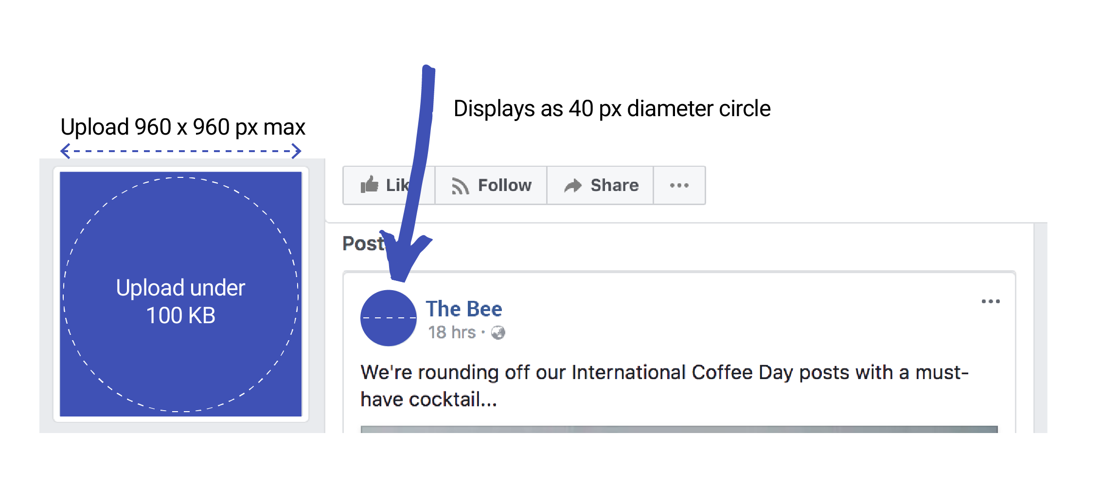
Before we start, let’s also keep in mind that the small profile picture is as important as the main one. The smaller the picture, the more crucial it is to have a clear and easy-to-read image.
Tip 1 — Layout
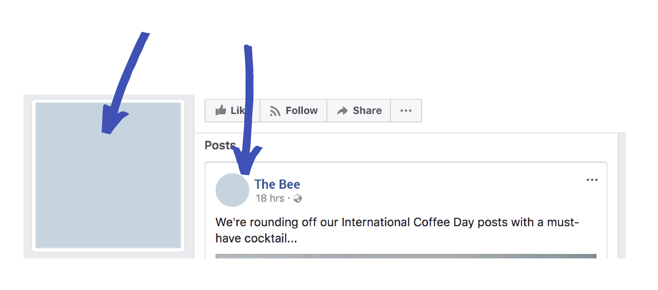
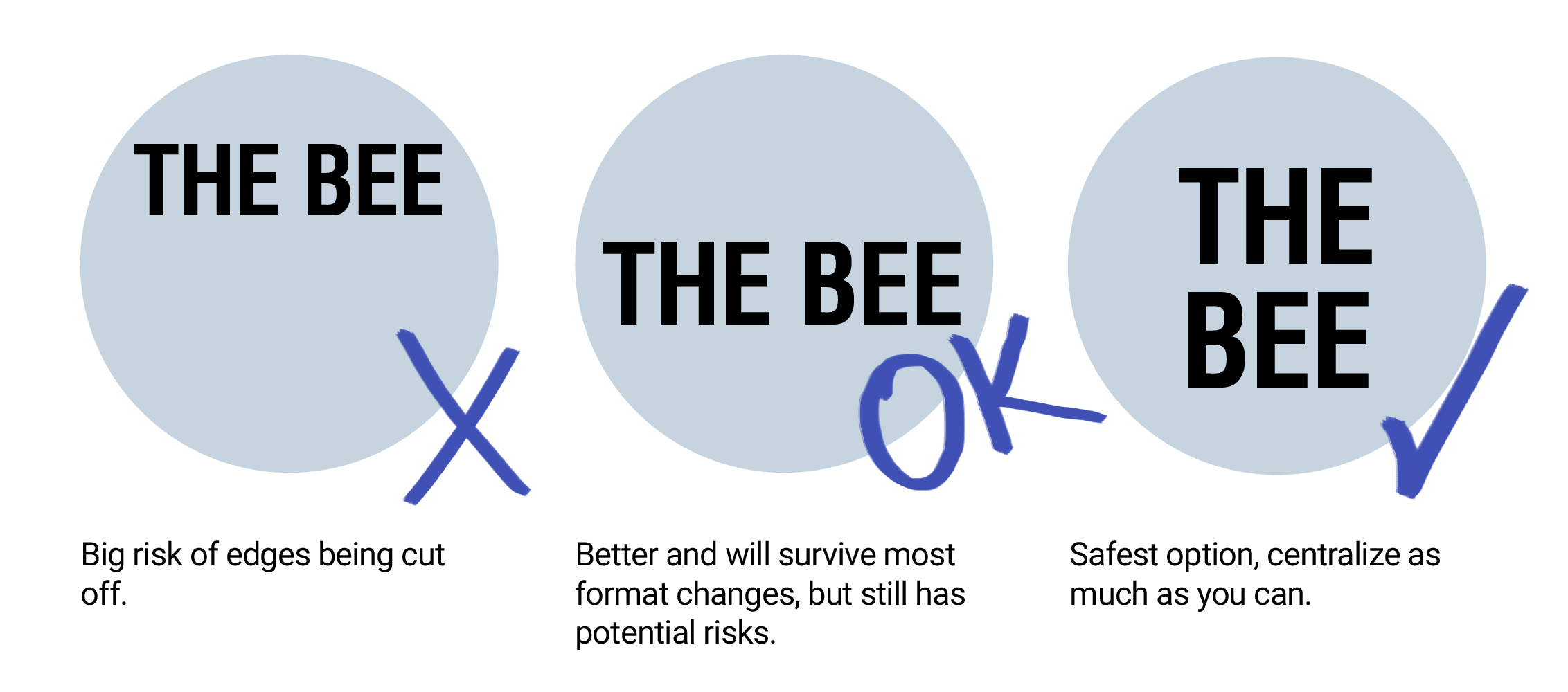
Facebook is constantly updating its display picture format. It used to be square but now it is round, for instance. This means that, to be safe, the positioning of your logo should be central so that it works with both circular and square formats. Doing this will eliminate the risk of the edges of your logo being cut off if the format changes.
PRO TIP: Make a grid in the image to show the safe zones.
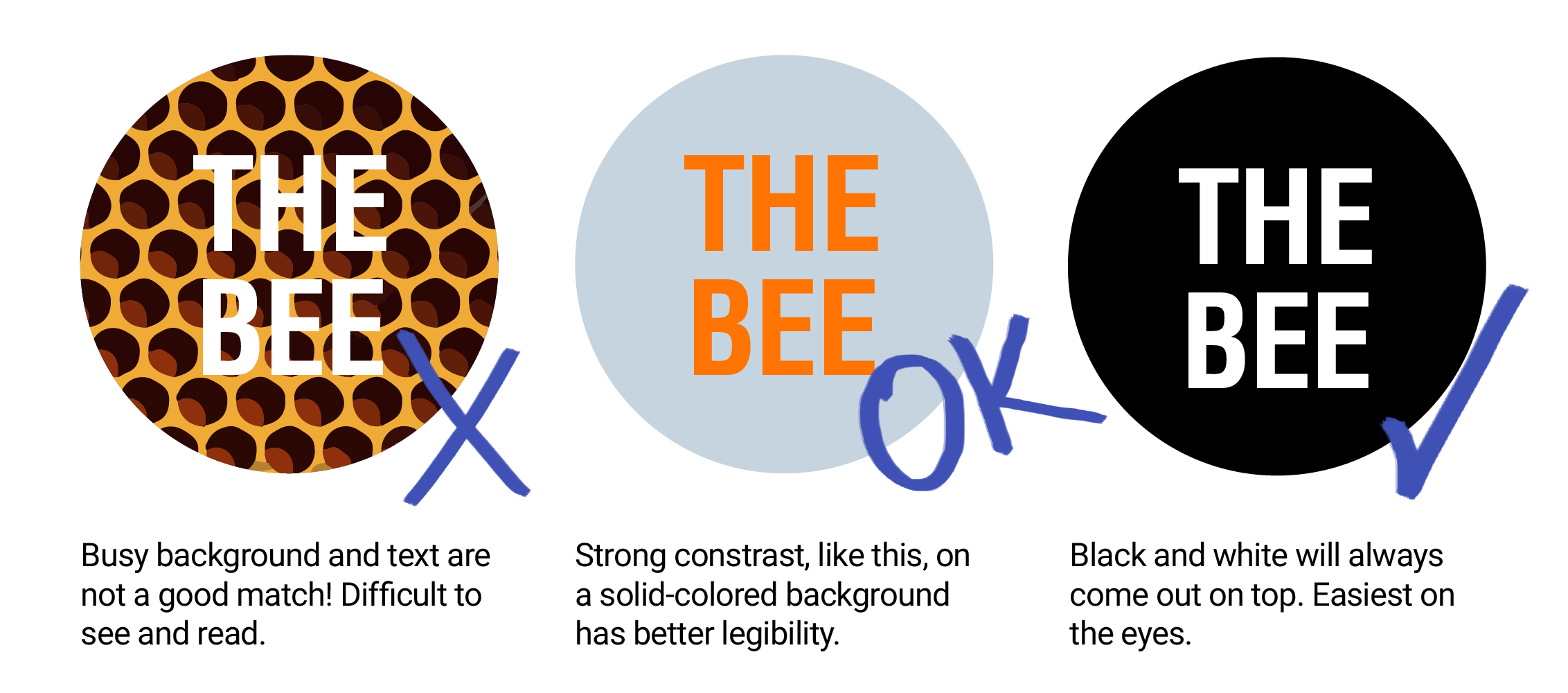
Tip 2 — Color
The impact of color grows stronger if we take into consideration the size of a social media logo. To ensure clarity, be mindful of the shades you use. Make sure there is a contrast between the text and the background. It is important to keep the background a block color as any sort of pattern will cause the text to become harder to read.
PRO TIP: When in doubt, a black and white combination always looks good together and is always your safest bet.
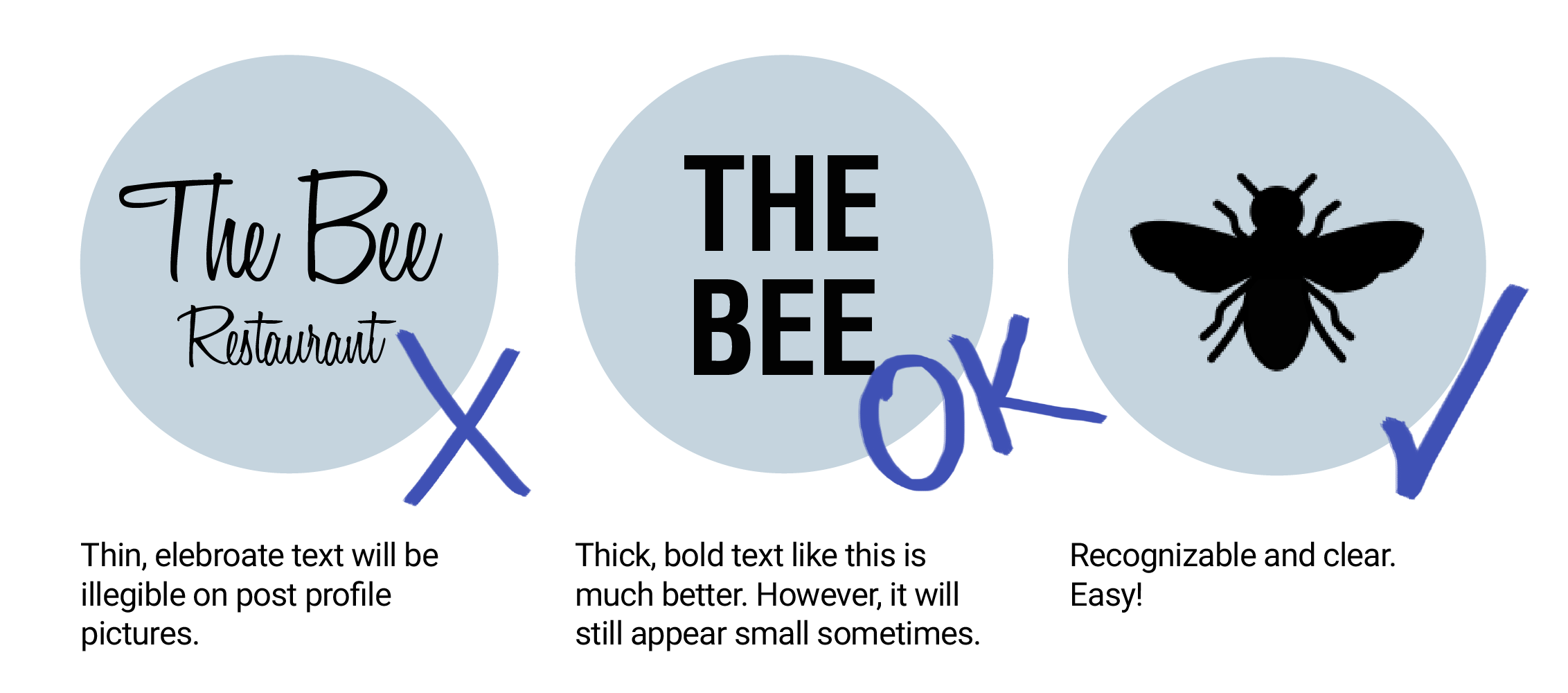
Tip 3 — Font Size and Type
Any font used needs to be big and bold! There is no point using a small font as it will be illegible. A thin type, too, will get lost. To create an even stronger logo, consider removing text completely and replacing it with an icon. Be brave!
PRO TIP: If text cannot be avoided, remember that it should take up at least 1/4 of the size of the square.
Lastly, dimensions!
Need a little guide to make sure your image doesn’t get compressed or look blurry? Do a test-run by saving your circular profile picture as small as 40 px to see if you can still read/understand the image, then you are good-to-go!